Median: The middle of what? Grade 10’s misconceptions
Teaching the concept of median to my grade 10 class on Thursday 21/08/2014 I made the following interesting observation:
How the problem became evident:
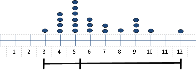
I was trying to explain why it is important to divide the data into two equal parts and made the following drawing:

Me: “This is two different sets of data with two different medians. What is the difference between the two sets of data if we look at the median?”
And I am waiting for an answer. (The data is spread evenly for the fist one but more “clustered on the left / more spread on the right for the second set.)
Me: ” Ok, here’s a hint for you: remember the median divides 50% of the data to it’s left and 50% of the data to it’s right. Now, what is the difference between the two sets of data if we look at the median?”
Again a great silence! And then it hits me: “So who of you feel that the first line is correct and the second line were drawn correctly?”
And almost all the hands went up.
Me (already anticipating the answer): “Why is it wrong?”
A learner: ” The median is not in the middle.”
The problem:
Learners view the median as the middle and in line 2 the median is not in the middle. The challenge is to let them understand that the middle of the data is not always the middle between the minimum and maximum.
How I addressed the issue:
I then complete a survey of their shoe sizes as follow:
This helped them to see that median is the middle of the data and do not have to be the middle of the line.
Please share more ideas.

Piet Human 4:19 pm on August 24, 2014 Permalink |
This misconception by learners (I would expect it to be quite common) is probably the result of the torrid curricular practise to rush into the “summary statistics” before learners have developed the habit to consider the nature of distributions first when they engage with data sets, eg by ordering the data from smallest to biggest.
It is a curricular misconception rather than a learner misconception.
An easy way to protect learners against (naturally) forming this misconception when confronted with “mean, median, mode” before they have had sufficient experiences with distributions of different kinds, is to simply hold “mean, median. mode” back till grade 10 or even later.
I think it is wise, when dealing with misconceptions, to always first ask “did curriculum teaching possibly cause this misconception” and if so talk to the teachers/curriculum-makers.
To be currently practical with respect to those grade 10’s:
Just let go of “mean, median, mode” for three lessons and let them compare data sets by just ordering he data from smallest to biggest. By that time median and mode will be natural self-constructed ideas, if the data sets were well chosen.
There are two fundamentally different ways of trying to get a sense of how the data in a set is distributed:
A. To group the data into intervals of equal width (histogram)
B. To group the data into bags with the same number of data items in each bag (e.g. quartiles or centiles or whatever choice about the number of bags with equal numbers of data items you choose, you can also have twintiles, octiles or pentiles or hextiles for example)
In the case of A, the percentages of the total number of data items that are in each interval gives you a summary picture of how the data is distributed.
In the case of B the intercentile (or interquartile, or interoctile or twintile what have you) points provide a quick picture of the nature of the distribution.
The median is a thing which belongs to tile-analysis (B) of distributions and makes little sense outside that context.
Including it earlier in the curriculum gives rise to a lot of completely crap questions being dished up to learners.
LikeLiked by 1 person
Mr B 5:25 pm on August 24, 2014 Permalink |
Insightful, I have to agree this is more of a curriculum caused misconception than a learner misconception. I also agree that the activity of arranging the data from minimum to maximum can help but I am concerned that it may be a contributor to the idea that it is in the “middle” of a “line”.
However, stacking the data that are the “same” as in my example can do more to reduce this idea. This is nothing new as Cobb, McClain, and Gravemeijer and their team at Vanderbilt University, Nashville, USA and Arthur Bakker from the Freudenthal Institute in Utrecht (Netherlands) pointed to this practice. Both studies clearly showed that by using computer software data that are manipulated as “stacked” data is better in the development of the understanding of these concepts. (See references below.)
Bakker even suggest that it may even be a good idea to even continue this “stacking” approach and super impose it on box-and-whisker diagrams to continue the development of seeing the “bump-effect” in distribution. It supply far more support for learners in the development of their diagrammatic reasoning about the distribution.
Bakker, A. (2004). Design research in statistics education: On symbolizing and computer tools. Utrecht: Freudenthal Institute.
Cobb, P., Confrey, J., diSessa, A., Lehrer, R., & Schauble, L. (2003, Jan/Feb). Design Experiments in Educational Research. Educational Research, 32(1), 9-13.
LikeLike
Piet Human 6:42 am on August 25, 2014 Permalink
The challenge for a fourth world country is to design materials that can do the same without technology and software being available.
LikeLike
Mr B 7:45 am on August 25, 2014 Permalink
This is why I am advocating simple drawings. If we use the box-and-whisker, show the data stacked on the number line that learners can see how many “pieces” are in each “bag” but also develop a sense of the “range” that these “pieces” cover. Both ensure a greater development of distribution.
LikeLike
Helena Wessels 9:32 pm on August 24, 2014 Permalink |
From my experience with undergraduate education students, I agree that working with stacked data fosters understanding of spread. Exploring data sets with software such as Tinkerplots (always followed by rich discussions) is also very useful in this regard.
LikeLike